-
[08.27 Special 강의] 통계와 차트 (Seaborn 🌊 정리)네이버 부스트캠프 AI Tech 2기 2021. 8. 29. 17:56728x90반응형
SeaBorn
SeaBorn 이란?
: Matplotlib 라이브러리 기반 통계 시각화 라이브러리이다.
특징
- 통계 정보 : 구성, 분포, 관계 등등
- Matplotlib이 기반이라서 커스텀 가능하다.
- 쉬운 문법과 깔끔한 디자인이 특징이다.

설치
(아직 1.0 version이 나오지 않아서 언제든 업데이트 가능성이 있다.)
강의는 0.11로 진행
!pip install seaborn==0.11

import seaborn as sns
다양한 API 제공
- Categorical API
- Distribution API : 분포
- Relational API : 관계
- Regression API : 회귀
- Multiples API
- Theme API
실습
Countplot
: 범주를 이산적으로 세서 막대 그래프로 그려주는 함수이다.
sns.countplot(x='컬럼', data= '데이터')
#=> x 축이 '컬럼' 범주로 나누어 진다.
#(y 축 기준으로 줄 수 있다.)

sns.countplot(x = '컬럼', data= '데이터',
                            order = sorted(데이터[컬럼].unique()))
#=> 정렬도 진행해준다.

sns.countplot(x = '컬럼', data= '데이터',
                            hue = '컬럼2',
                            order = sorted(데이터[컬럼].unique()))
#=> 컬럼2를 기준으로 나눠서 표현해 줄 수 있다.

sns.countplot(x = '컬럼', data= '데이터',
                            hue = '컬럼2', color = 'red',
                            order = sorted(데이터[컬럼].unique()))
#=> 색상도 지정할 수 있다.

sns.countplot(x = '컬럼', data= '데이터',
                            hue = '컬럼2', color = 'red',
                            order = sorted(데이터[컬럼].unique()),
                            saturation=0.3)
#=> 채도도 지정할 수 있다.
1. Categorical API
대표적으로 Box Plot을 활용한다.
sns.boxplot(x='컬럼', data = '데이터', ax=ax)
ply.show()
#median, quartile을 구할 수 있다.

sns.boxplot(x = '컬럼', y = '컬럼', data = '데이터' ,ax= ax)
plt.show()
#컬럼안에 있는 요소로 나눠서 보여줄 수도 있다.
Violin Plot
Box plot은 분포를 간단하게 표현해주는 데는 적합하지만, 실제 분포를 표현하기에는 부족하다.
sns.violinplot(x='컬럼', data=  '데이터', ax=ax)
plt.show()
하지만, 이런 violin plot은 오해를 일으킬 수 있다. 이산적인 값들을 연속적으로 표현하다 보니 없는 데이터를 있는 데이터 처럼 보여주는 경우가 있다. 또한 데이터도 연속적이지 않다.
그래서 bandwith, cut, inner 같은 것들을 활용해서 추가적인 정보를 표현한다.
sns.violinplot(x = '컬럼', data = '데이터', ax = ax,
                            bw = 0.1, #구간을 세분화 시켜준다.
                            cut = 0,
                            inner = 'quartile'
                            )
ETC
- boxenplot
- swarmplot
- stripplot
sns.boxenplot(x='컬럼', data = '데이터', ax=ax)
sns.swarmplot(x='컬럼', data = '데이터', ax=ax)
sns.stripplot(x='컬럼', data = '데이터', ax=ax)
2. Distribution API
: 범주형/연속형을 모두 살펴볼 수 있는 분포 시각화를 진행
2-1) Univariate Distribution
- hisplot : 히스토그램
- kdeplot : Kernel Density Estimate(연속 확률 밀도)
- ecdfplot : 누적 밀도 함수
- rugplot : 선을 이용한 밀도 함수
sns.histplot(x='컬럼', data = '데이터', ax=ax)

#parameters
1. binwidth : 막대 너비 조정
2. bins : 막대 개수 조정
3. element : ('bar', 'step', 'ploy') 종류를 지정
4. multiple : ('fill', 'layer', 'dodge', 'stack', 'fill') N개의 분포를 표현할 수 있다.

#============================================================
sns.kdeplot(x='컬럼', data = '데이터', ax=ax)

#parameters
1. fill : 내부를 채울지(True, False)
2. bw_method : 분포를 자세히 표현
3. multiple : ('stack', 'layer', 'fill') N개 분포를 다양히 표현
4. cumulative : 쌓아나갈지(True, False)

#============================================================
sns.ecdfplot(x='컬럼', data = '데이터', ax=ax)

#parameters
1. stat : 전체 양으로 볼지('count'), 비율로 볼지('proportion')
2. complementary : 0부터 시작할지(True, False)

#============================================================
sns.rugplot(x='컬럼', data = '데이터', ax=ax)
2-2) Variate Distribution
: 2개 이상의 변수를 동시에 분포를 살펴본다.(결합 확률 분포를 살펴본다.)
- hisplot
- kdeplot
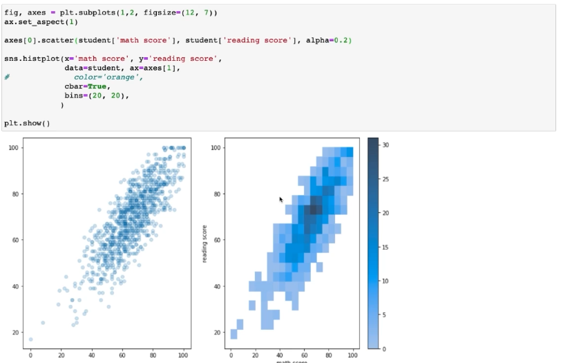
이처럼 Scatter Plot에서 겹치는 문제를 개선할 수 잇다.
3. Relation & Regression API
3-1) Scatter Plot
sns.scatterplot(x = '컬럼1', y = '컬럼2' , data = '데이터',
    style = '스타일',
    hue = '구분',
    size = '크기')
3-2) Line Plot
sns.lineplot(data = '데이터', ax = ax)
#각 컬럼에 대해서 색을 지정해서 다 그려줄 수 있다.

sns.lineplot(data = '데이터', x = '컬럼1', y = '컬럼2', hue = '구분컬럼',
    style = '적용할 컬럼',
    markers = True, #마킹 여부
    dashes = True ,
    ax = ax)
4. Matrix Plot
4-1) Heat Map
: 히트맵은 대표적으로 상관관계를 볼때 활용한다.
sns.heatmap(데이터.corr(), ax= ax)
plt.show()

#parameters
1. 상관계수는 -1 ~ 1 까지 임으로 색의 범위를 맞추기 위해서 vmin, vmax를 지정할 수 있다.
2. center를 지정해서 기준점으로 음/양을 표현한다.
3. cmap을 바꿔줌으로써 가독성을 높힌다. ex) 'coolwarm'
4. annot, fmt : 데이터의 실제 수치 값도 적어줄 수 있다.
5. linewidth : 칸 사이를 나눌 수 있다.
6. square : 정사각형을 사용할 수 있다.(True, False)

#종합
fig, ax = plt.subplot(1, 1, figsize=(12, 9))

sns.heatmap(데이터.corr(), ax = ax,
                        vmin = -1, vmax = 1,
                        cmap = 'coolwarm',
                        annot = True, fmt = '.2f',
                        linewidth = 0.1, square = True)
plt.show()
활용
JointPlot
: jointplot 같은 경우 여러 피처의 결합확률 분포와 함께 각각의 분포도 살필 수 있는 시각화를 제공한다.
sns.jointplot(x = '컬럼1', y = '컬럼2', data = '데이터')

#parameters
1. kind : ('scatter', 'kde', 'hist', 'hex', 'reg', 'resid') 다양한 종류로 분포 확인 가능하다.(hue와 같이 사용이 안되는 것들이 있다.)
2. fill : 채울지 말지 (True, False)
Pairplot
: 데이터 셋의 pair-wise 관계를 시각화하는 함수이다.
sns.pairplot(data = '데이터')

#parameters
1. kind : 전체 서브플롯 조정 ('scatter', 'kde', 'hist', 'reg')
2. diag_kind : 대각 서브플롯 조정 ('auto', 'hist', 'kde', None)
Facet Grid
: Pairplot 처럼 다중 패널을 사용하는 시각화를 의미한다.
차이점 : pair-plot 은 feature-feature 사이를 살폈다면, Facet Grid는 feature-feature 뿐 아니라, feature의 category - feature의 category 관계도 살펴볼 수 있다.
다음 4가지가 Facet Grid를 기반으로 만들어졌다.
- Categorical ⇒ 'catplot'
- Distribution ⇒ 'displot'
- Relational ⇒ 'relplot'
- Regression ⇒ 'lmplot'
Categorical ScatterPlot들
- stripplot() → kind = 'strip'
- swarmplot() → kind = 'swarm
Categorical DistributionPlot들
- boxplot() → kind = 'box'
- violinplot() → kind = 'violin'
- boxenplot() → kind = 'boxen'
Categorical Estimate Plot들
- pointplot() → kind = 'point'
- barplot() → kind = 'bar'
- countplot() → kind = 'count'
sns.catplot(x = '컬럼1', y = '컬럼2', data = '데이터')

#Row 와 Col의 조정할 수 있다.
#=> 각 Row와 Col을 기반으로 그래프 개수가 조정이 되기 때문이다.
#kind도 추가가능
Displot들 (Distribution)
- hisplot() → kind = 'hist'
- kdeplot() → kind = 'kde'
- ecdfplot() → kind = 'ecdf'
sns.distplot(x = '컬럼1', y = '컬럼2', data = '데이터')relplot들 (Reloational)
- scatterplot → kind = 'scatter'
- lineplot → kind = 'line'
sns.relplot(x = '컬럼1', y = '컬럼2', data = '데이터', hue = '구분', col = '행')Implot들 (Regression)
sns.lmplot(x = '컬럼1', y = '컬럼2', data = '데이터')반응형'네이버 부스트캠프 AI Tech 2기' 카테고리의 다른 글
🏃 Mask Image Classification [P Stage Wrap up 개별 리포트] (2) 2021.09.06 논문 리뷰 - Improving Language Understanding by Generative Pre-Training(GPT-1) (0) 2021.08.30 [08.27 P Stage Day5] - 🔥 First Week Retrospective(Image Classification) (0) 2021.08.28 [08.27 P Stage Day5] - 🔨 Ensemble & Experiment Toolkits (0) 2021.08.28 [08.26 P Stage Day4] - 📝 Training & Inference (0) 2021.08.28